Saturday, 20 January 2018

OUGD601 - Practical - Type

I next needed to consider how I wanted to use typography to support each composition on a whole 


- more of a current, experimental typeface to match that of craft: Savate? Resistance? VTF? with their varying contrasting stroke widths and glyphs; or even one of the Mono typefaces as they are legible yet intriguing.
- Classic/ classy/ traditional approach: Didot? Caslon? Bagnard? Much more traditional and sophisticated look to these - more of a high end feel - look good warped.
- I considered a range of hard-hitting Sans-serif typefaces too. The structure within these definitely give legibility and impact for headings, etc. 
- Berthold is very rounded and clear
- Akzidenz Condensed allows for bold headings in small places - can slightly stretch and warp, as the sharp edges and corners give it a distinctive appearance
- American P and Daxline provide a range of weights - ideal for variation - thin to heavy, also provide more character with the over-rounded bowls and counters.
- Also considered how a slab serif can provide the legibility of a sans-serif typeface, with the authority and impact of a serif typeface - Dobra providing the variation whilst Wellrock is a more irregular, experimental body copy.
- I also considered a range of more traditional typefaces too - more fancy hand rendered brush strokes reflecting that of traditional signage - Festival & Hominis. 
- To more industrial, bolder typefaces - Steelworks, High Voltage and Wicked - slight erosion/gain to them really reflecting that gritty, traditionally produced style similar to the effect of letterpress - gives a very hand-crafted feel which fits perfectly with the craft selling points.

BREWDOG - Letterpress Justification

Scottish business BrewDog felt it was time to alter its packaging to ensure the look and feel of its bottles continued to match the craft and passion inside them.

"When we changed our packaging in 2014, we had one aim in mind: to create packaging that better reflected the beer we make," explains BrewDog's resident 'beer bandito' Jonathan Moran. "That meant focusing ruthlessly on quality and craft.
We've done that by stripping the design process back to basics; by going to one of the UK's few remaining letterpress studios to hand-print our designs using 100-year-old metal and wood letter blocks; by applying layers of ink with as much personality and character as the beer inside the bottle."


To keep some of that tactile feel that is common with letterpressing, the labels feature embossing and spot varnishing to further enhance the raised effect. Coupled with well-executed typography and layout, the new BrewDog packaging is leaps and bounds better than the old.


The process and effect of the letterpress is that it keeps the design process and style at bay with the traditional and hand-crafted beer itself - the imperfections of the ink reflect the character and experimental ethos of the brewery, whilst the form still feels bold and trustworthy.


I looked at various traditionally style / more hand rendered style branding flash sheets by various artists.


Was interesting to see how the type is partnered with the looser illustrated image to create the composition of the logo - laid out in various structures/grids, within borders or shapes, inverted or outlined. 


Some feel more simplified - prioritising the character of the type itself, rather than complicating the layout. 
But some work in more intricate layouts which would be more appropriate for craft beer fitting within a set label space with various space for detailing such as Est. date, ABV % of the beer, etc.


Using a combination of my illustrations and the typefaces I had considered I began creating my own layouts for logos
- I felt considerably inspired by the almost stamp style - fitting it into a set space/shape to sit clearly on the label of the beer - but can also sit anywhere else - be it on draught pump taps, beer matts, t-shirts and other merch.


- Trialled the serif Bagnard in upper case (top left) - looks official, but more like a grave stone than a craft beer brand - like the layout and enclosure tho.
- Steelworks - used the normal upper case lettering, fancy swirly characters were too much. Provides a thinner variant to the letter-pressed ink style, whilst the industrialism of it gives it authority and makes it feel official and trustworthy.
- High Voltage - high impact, bold, letterpress style - reflects the tradition, heritage and quality craft gone into the brewery.
- Savate fits the whole surrealist feel with its irregular form - is intriguing and feels modern/new wave - perfect for a wacky craft brand?
- Trialled the bold sans type Daxline - very hard-hitting and legible yet not the right approach, too basic.

Applied the ideas to the Carling Black Label concept..


This time trialling the size distribution of each element - which bit do I want attention first drawn to? How will that guide your eye around the rest of the logo?

- Can I warp and stretch the type to fit? How does the kerning make the content more bold and impactful?

Was clear to me how the sans-serif options of the Zamalek IPA was definitely more appropriate for the background and style of the beer I am going for. 

Also being ultimately designed under the Carling brand - it should be somewhat consistent. 
And these more industrial feeling, bold typefaces like High Voltage, Steelworks mixed with Akzidenz Condensed for narrower content provides that consistency better than any serif typeface could.

The new Carling logo even references the past, through the use of the 'Black Label'.

A crit feedback session did suggest to me how the arched approach was the most effective layout - and the design itself didn't have to be enclosed within a border - this leaves space to experiment with the background and make it consistent with other distributions /outputs.
It also fits nicely with some of the arched illustrations I had already produced. Can position the text to fit in other bits of detail about the product within the layout.


Friday, 19 January 2018

OUGD601 - Practical - Black Label

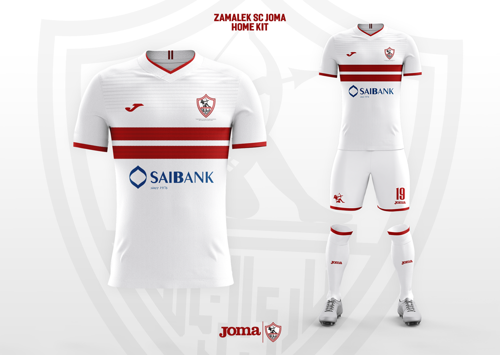
Black Label has the slang/street name of Zamalek in South Africa, because of an association with the Egyptian football club of the name which shares the colours black, white and red.

Urban Dictionary suggests how..

In the 90s Egyptian team 'Zamalek' played against South African team 'Kaiser Chiefs' and got out-classed.
Local fans began claiming how Zamalek F.C are as strong as a pint of Carling Black Label!

And that is where the local nickname came from.

I can definitely use this to strengthen my concept alongside the Black Label idea.

The clubs colours are black, white and red which I can reference.


The last illustration I did featured a sandy, desert background and palm trees - I am going to play on this Egyptian concept to develop the illustrations. 

Remember - am celebrating 200 years of Carling 
                 - going to approach it as a spin off of Black Label 
                 - 'The Black Label IPA' or 'The Zamalek IPA' or 'The Zamalek v.2'

I played with the style - as preferred the solid black lines over vectorised shapes - & introduced an eye (kind of Egyptian) 
- Can introduce colour scheme via background textures as shown beneath..

OUGD601 - Practical - Illustrations & Approaches

I have always loved tattoos and have been inspired by the various styles and works of art within the tattoo industry. In my own personal illustration style I have recently been experimenting with bold, black-line pieces, often feeling quite surreal which could link into the whole trendy IPA scene - especially for Carling 'Black' Label!

I considered how Grandin for Omnipollo uses the label design as a platform for his own experimental illustration work - the same idea behind the brewing of the beers - but experimentation with taste. It's their weird take on it.
So I considered how I could fit my concept around that - a platform to celebrate various artists, for various reasons, etc. Similar to the Patron Projects by Northern Monk.

- Experimented with ornamental designs. (Can have deeper meaning)


- As well as more linear, blackworker pictograms.


- I'm also always being inspired by various favourite artists on social media, etc. 


- This style can be very basic and bold, but is also very current - I love the mystery staircase and open window designs - almost surrealist??


My illustrations..

Ornament experimentation 
- created a design for a quarter and then duplicated and mirrored it to create the rest of the pattern.

- Beneath are my tattoo inspired illustrations
I love sunsets, small pictograms, hands and surrealism - The mystery black windows / portals / staircases / ladders

- It's like we don't where we're going but we're content and will always enjoy the journey - can reflect the ethos of an experimental independent craft brewery.


- The works of George Greeves inspired me to see how each piece could fit together or be presented in a weird floating room differently for example.

- Started to think about how stripped back use of colour can affect the mood of the piece too.


- Started to introduce stars and space-y vibes inspired by Nick Dwyer 

- How could a scene wrap around the bottle? 

- Have the main graphic central with background wrapping round but quite plain to fit text and ensure legibility.

- Could I even combine this with my Irish idea and feature the Leprechaun inside???

- The introduction of colour got me thinking on the complete opposite side to the spectrum.

Could I approach it with a completely minimal style which suggests its story through subtlety? - depends on the brand


- Aimed to not be over-whelmed by information but is hard-hitting and sits the graphics and story of the beer as key.

- Used the ornaments as little variants between the different flavours of the brew. 
- Same beer concept and range, just different variant - still consistent with each other however.


Other illustrations have inspired me to consider a vectorised more colourful approach perhaps?

Beach/ summer vibes aim to invoke those emotional responses with consumers - summer days with friends and family.


OUGD601 - Practical - CARLING

- Founded in London, Ontario, Canada in 1818.
- In 1952 Carling lager was first sold in the UK
- In the early 80s it became the UK's most popular beer brand (by volume sold).


The history of Carling dates back to 1818, when Thomas Carling, a farmer from Yorkshire in England, and his family settled in Upper Canada, at what is now the city of London, Ontario. He brewed an ale which became popular, and eventually took up brewing full-time.

Carling sponsored English football's Premier League from its second season in 1993 until 2001, returning as an official partner in 2016, and the Reading and Leeds festivals from between 1998 and 2007.

There is already quite an array of product range:
  • Carling Black Label is a beer sold in Canada and South Africa; it is the best-selling beer in South Africa. It has an alcohol content of 5% in Canada and 5.5% in South Africa.
  • Carling, formerly known as Carling Black Label, is a mass market lager in the United Kingdom with an alcohol content of 3.7%. Molson Coors marketing makes no reference to its Canadian origins, describing it as "British".
  • Carling Black Label Ice, or "Black Ice", is a strong, low-priced ice beer sold in Canada with an alcohol content of 6.1%; sold as Molson Ice in the United States using a variation of the Black Label Ice label and logo.
  • Carling Light is a lighter variation of Carling Lager.
  • Carling Premier is a cream-flow lager with an alcohol content of 4.7%, introduced to celebrate Carling's sponsorship of the FA Premier League in 1992. In cans it is sold with a nitrogen widget, similar to those used in some canned ales. Unlike most lagers, Premier needs time to settle.
  • C2 is the low-alcohol version of Carling, with 2% alcohol by volume.
  • Carling Black Label Supreme is an inexpensive 8% alcohol brew.
  • Carling Black Label Big 10 has 10% alcohol content.
  • Carling Chrome is a bottled lager, brewed for a less bitter taste at 4.8% abv.
  • Carling Cider
  • Carling Zest is a 2.8% lager that has different flavors, including ginger and citrus.

Carling Black Label

- It is still called Carling Black Label in Australia, Canada, and South Africa. 
- In Ireland and the United Kingdom the same beer has been sold as Carling (without 'black label') since 1997. 
- In Sweden it is known as Carling Premier.

Black Label is a brand of beer well known throughout the former British Empire, where it was known for its slogan "Hey Mabel, Black Label!" The most famous slogan for this product was, "I bet he drinks Carling Black Label!"


"Champion men deserve champion beer"

I could play on this Carling Black Label ploy and go back to the roots with a classic rebrand?
Or re-appropriate the Black Label to create some new, current IPA spin off?

I need to consider my other inspirations and potential style approaches I could take with it 


OUGD601 - Practical - Crit / Direction

After taking my current ideas and Irish illustrations to a crit session, it was highlighted to me how I should consider which commercial brands have actually already started spin-off 'craft inspired' products in a hope to re-lighting the spark in commercial lager. 

Image result for hop 13Guinness already have the Hop 13 spin off
- a 'premium crafted' lager 
- very current, sharp graphics  
- much more artisanal than traditional


In 2016, they also began working to re-energize the brand to stay relevant in a quickly changing beer landscape in the United States and abroad. - i.e. to keep up with craft!

The company is picking up its pace of innovation and experimentation under an initiative named the "Brewers Project," which is designed to breathe new life into the historic brand at a time when more beer drinkers are repeatedly looking for the next new thing. - picks up on the values of craft!


The Brewers Project was created in 2014, but Guinness officials are quick to say that experimentation and innovation have always been a part of the company's DNA - to cover up for copying the approaches of craft brands!
As part of the project, the company is digging into its archives to find inspiration from historical recipes while looking to tap into current trends.

The first two Brewers Project beers to hit the U.S., Guinness Blonde American Lager and Guinness Nitro IPA, have met with mixed reviews.

Guinness Blonde American Lager was an effort to tap into the still dominant macro-beer style in the U.S, with the twist of using Guinness yeast in the lager.

The Guinness Nitro IPA was a combination of the company's pioneering nitrogen roots paired with the current dominant style in the craft beer segment, the India pale ale. While Guinness created the nitrogen-infused stout, "nitro" beers are now a trend in the craft space.

Guinness West Indies Porter and Dublin Porter
I began looking into other commercial brands I initially stated (besides Carlsberg which I have previously discussed in the essay), and I found that the all-American Budweiser had done something similar..

Budweiser Takes Aim at the Craft-Beer Crowd with "Black Crown"


As craft beer continues to chip away at macro-brewery dominance, Anheuser-Busch is attempting to refresh Budweiser’s image with a new deep-amber lager called Black Crown. Slated to appear on shelves early next year, the new Bud is the winner from a Project 12 crowdsourcing trial run: three limited-edition beers were released in a sampler pack this fall, with recipes selected from brewers around the country. Black Crown is the one that got voted into full production.


They also already have a pale ale design - which feels like a weird cream soda brand!


They are company which are proud of the fact they brew standard lagers and demonstrate that with this bold typographical poster.. Maybe should stay away from them.

Guiness have already tried 'craft' in more ways than one so could still consider creating new outputs for them.


_______________________________________________________________

The critical encouraged me to go back and look at the concepts discussed within my essay and then re-approach how I could go about producing my practical craft beer response.

In the essay key concluded points include:

- Expression of identity.      - Group Membership
- Social Comparison

- Branding provides the visual meaning to the personality of the brand and consumer
- Needs to emotionally engage them to be consistently success - evoke experience and memories
- How specific brand loyalty is harder to achieve in craft.

- The effect of tone of voice and personality - less serious, tongue and cheek, rude, humorous

The selling point of craft is how it is new, non-global, authentic, artisinal, feels more exclusive, connoisseurship
- And how the commercial are trying to buy into this now

Does the design ever come first? - essays no but it obviously has a clear affect on branding, entices you to trying different flavours, but at the end of the day it is all about the functional properties of the product. 
- so does the design need to be clear representation or not? 
Omni-pollo are an example of a brewery who are pushing those boundaries further through specific and consistent art by the Grandin - but has a certain random, unfinished, but its meant to be feel to it.

NEW DIRECTION IDEAS -

  1. Testing whether design does come first? does it have to be relevant? along as there is a concept, it can be as ambiguous as I see fit. - more about using it as a platform to celebrate artists/ the industry/ etc. How far can I push the boundaries and tone of voice?
  2. Commercial brands buying into the selling points of craft - non-globalised, authentic and artisanal. Spin-off / re-creation / introduction of new craft ale.
  3. Focus on the growing target audiences within craft that my research showed me - women, hispanics, millennials who are very techy.

  1. BUT, do I want to create my own brand..
  2. OR, re-purpose an existing one?
We agreed it would be stronger to re-purpose an already existing one as this sets some restrictions down but this is not necessarily a bad thing. Gives me more of a brief guideline to work within.

I need something to celebrate - a purpose / reason for the new beer which will reside with people. - Craft values heritage?? Consider ages of breweries?

IRL - St. Patricks Day is 17th March 2018 - so could design for this!?

CARLING - not only my favourite commercial lager
             - Approaching its birthday of 200 years!! - RESEARCH THIS!

OUGD601 - Practical - Cheeky Leprechaun

Approaching my ideas to the Irish themed Guiness IPA which I wanted to introduce, I was already considering how I can use a humourous / popular culture (meme) inspired approach to really engage with my consumers and catch their eye.

This immediately made me think back to an episode of Rick and Morty.. 
(Rick is a mentally-unbalanced but scientifically-gifted drunk old man who has recently reconnected with his family. He spends most of his time involving his young grandson Morty in dangerous, outlandish adventures throughout space and alternate universes. Compounded with Morty's already unstable family life, these events cause Morty much distress at home and school.
Introducing a lot of crude wit and mockery of our modern society
)

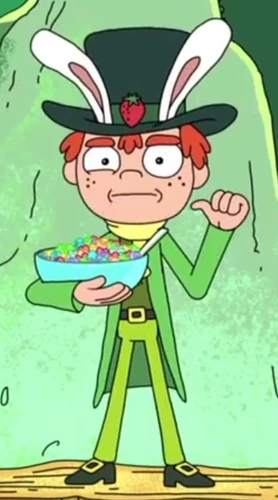
Top Hat Jones is a breakfast cereal mascot that appears in a commercial for Strawberry Smiggles in the episode "Rixty Minutes", and has since then made numerous appearances in Rick and Morty, along with the Strawberry Smiggles product itself. Jones is a parody of Lucky the Leprechaun, the mascot for Lucky Charms, and the Trix Rabbit, the mascot for Trix Cereal: He wears traditional leprechaun attire, but has a pair of white rabbit ears and a top hat.

And the whole value of the ad which he appears on is how he is selfish and greedy with his Strawberry Smiggles, but then get his intestines ripped out by ravaged hungry kids! Very vulgar but humorous to our current younger generations demographic.


I recreating him in Illustrator from one of the scenes and then modified his stance and hands to fit him holding a beer so I can re-appropriate his meaning and relevance and re-use it but applied to a different product. I also experimented with how he could have various gestures with the other hand...


This built into further experimentation with the leprechaun form and how he can be made to look older, etc. Once I had the vectorised shapes infront of me, I enjoyed manipulating them to adjust the overall feel and look of the character so it was more original - as feedback from course mates did suggest how it is a whole-y original idea.

I created this guy..

A more traditional looking leprechaun.
- Doctored the hat and added the shamrock so more typically Irish.

- The cane gave a nice balance to his stance - you think Willy Wonka, a well accomplished but wacky experimental creator.

- The older character fits the 18+ demographic better and still feels cheeky and new with the vectorised, crisp shapes.


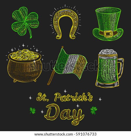
I also began considering how I could roughly illustrate typical Irish objects and fit them together for a label graphic..


More of a simple, obvious approach to the Irish theme - still very easily recognisable however.

OUGD601 - Practical - Guiness Ideas


- Dark Colour Scheme like Guinness - black, brown, gold, cream
- but mimicking the Irish colours simultaneously - green, gold, orange

Leprechaun character:


Existing market for obvious Irish Beers:


Steve Simpson
Irish themed illustration for Magners Cider (Canada) 
- Broke up sections of the illustration for use in promotional material inc. bar poster, table talkers, hand outs, coasters, tees etc


Tone of Voice Considerations:
The Irish are stereotypically
- drunks! - loud, bold, potentially charming, ginger!

"The Irish One"
"I'll be the top of your morning"
"Feeling lucky"

Typical Irish objects/things: 

- Leprechaun's Top Hat
- Shamrock / clover
- Rainbow
- Pot of Gold
- Coins
- Harp (guinness)
- Flag
- Stein
- Horse shoe for luck!
- Irish football / Gaelic football / Hurdling