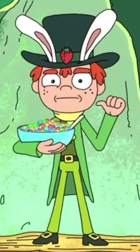
This immediately made me think back to an episode of Rick and Morty..
(Rick is a mentally-unbalanced but scientifically-gifted drunk old man who has recently reconnected with his family. He spends most of his time involving his young grandson Morty in dangerous, outlandish adventures throughout space and alternate universes. Compounded with Morty's already unstable family life, these events cause Morty much distress at home and school. Introducing a lot of crude wit and mockery of our modern society )
 Top Hat Jones is a breakfast cereal mascot that appears in a commercial for Strawberry Smiggles in the episode "Rixty Minutes", and has since then made numerous appearances in Rick and Morty, along with the Strawberry Smiggles product itself. Jones is a parody of Lucky the Leprechaun, the mascot for Lucky Charms, and the Trix Rabbit, the mascot for Trix Cereal: He wears traditional leprechaun attire, but has a pair of white rabbit ears and a top hat.
And the whole value of the ad which he appears on is how he is selfish and greedy with his Strawberry Smiggles, but then get his intestines ripped out by ravaged hungry kids! Very vulgar but humorous to our current younger generations demographic.

I recreating him in Illustrator from one of the scenes and then modified his stance and hands to fit him holding a beer so I can re-appropriate his meaning and relevance and re-use it but applied to a different product. I also experimented with how he could have various gestures with the other hand...
This built into further experimentation with the leprechaun form and how he can be made to look older, etc. Once I had the vectorised shapes infront of me, I enjoyed manipulating them to adjust the overall feel and look of the character so it was more original - as feedback from course mates did suggest how it is a whole-y original idea.
I created this guy..
A more traditional looking leprechaun.
- Doctored the hat and added the shamrock so more typically Irish.
- The cane gave a nice balance to his stance - you think Willy Wonka, a well accomplished but wacky experimental creator.
- The older character fits the 18+ demographic better and still feels cheeky and new with the vectorised, crisp shapes.
I also began considering how I could roughly illustrate typical Irish objects and fit them together for a label graphic..
More of a simple, obvious approach to the Irish theme - still very easily recognisable however.


No comments:
Post a Comment