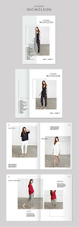
Looking at visual examples which I found attractive for the cover I knew I wanted it to reflect these modernist ideas of grid, layout, negative space and use of type. Below are examples of how I could lay it out but they all would need adjustments to be an appropriate response..
Very minimal, makes use of rotated text/headers/footers, type would need to be reconsidered as I want to represent modernism with typical sans-serif typography.
These two make use of colour but it would have to be justified and relatable as I don't think I will be featuring much colour other than that in the imagery I will be using
This example shows how I could incorporate an acetate/transparent stock over the cover. Could feature the type over the top so you can turn the page to get it away and souly focus on the image present - thus enhancing space and the context.
I then came across examples of lookbooks which have attached/built in envelopes that they are delivered in but actually become part of the publication..
I absolutely love this idea as it considers how the publication will be protected and delivered to peoples homes through the mail or even just upon being handed it. It gives it a more exclusive feel of having to open it up out of the envelope. In this example the type which features on the cover is also on the brown envelope in the exact same space. It appears very effective upon opening it up and I love the strict alignment of text it makes use of. This is something I am going to carry forward into my lookbook for sure!
These influenced my initial sketches for the cover considering how I could set the type to most effectively appear on the brown enclosing cover without the image featuring..
I illustrate the idea behind it above and this brought me to experimenting with some layout examples on CAD..
As shown above, I love the layouts which make use of rotated type and I even experimented with a background colour on one of them but quickly cancelled this out as it will show no consistency with the rest of the publication.
To be most inspired by the modern principles I wanted my publication to reflect a consistent aligned structure throughout so settled on aligning everything to the left margin with the intentions of this being carried out through the whole lookbook.. This way the type will appear most effective, considering form following function, when present on the brown outer cover that it will be delivered in..
I make use of a consistent in form sans-serif typeface for this called Perfectly Amicable, with the intentions (like Vignelli) to limit myself to this and then a single different body text font which will be thinner to accommodate scale. As perfectly amicable is ideal for headings and larger scaled type due to its stem weight but will not function aswell at smaller scales. I think for this reason I will use Helvetica Nueue Light for the body text inside the lookbook to ensure this sans-serif consistency, legibility and readability.


No comments:
Post a Comment