Being inspired by minimal editorial and lookbooks I started sketching up some possible layout styles..
As shown above, I planned how nearly everything would be aligned to the left to ensure consistency in the grid and with the cover design. This includes the header - page numbers, footer - lookbook season and title, and also any type or imagery used. I did experiment with a layout for the artists intro page which was centralised but I feel like it sways away from the whole consistent style. However, the spreads featuring the two examples of their work will be centralised but this will be justified within the grid and be consistent on every one of these pages.
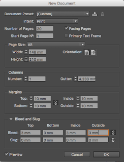
I moved to CAD to start producing the physical thing to get a more accurate idea of how the contents can be laid out on each page. I chose 10mm margins to feature all the way round each page..
In terms of the grid, an 8 x 4 set up would provide me with the ability to easily centralise items but also align them to the left and achieve consistent length..


No comments:
Post a Comment