
- Evil Twin use a mix of humour and simplistic graphic design to make their beer labels stand out.


Tone of voice used when describing the beers:
- "An alien-like outsider, always flirting with oddity and exploring anxiety and paranoia. A style chameleon, a wonderful labyrinth and truly a transcendent genius. It’s impossible not to idolize out of proportion. This is a stout. It may not be a hero but it’s attractive, clever and hungry for stardom.
- "Vegan-style berliner weisse ale with mango and pineapple added. Da fuck!"
- The tone of voice is very casual and witty, yet quite intellectual at the same time - reflecting that of the target audience, more working/middle class.


Tone of voice used when describing the beers:
- "The concept was to create a juicy tropical beer. A brew you can sit on and drink all day, rammed with juicy malts and huge tropical aromas of mango and grapefruit. Massive additions of American hops are added to the whirlpool giving huge hop flavour. The beer is then dry hopped for days, driving the punchy aromas so you can smell it from miles away!"
- Easier to read, to the point, and lets the bold illustration do most of the talking.


- "Like Hot Chics on the Beach"
- More cheeky but still straight-forward. Lets the illustration have the initial impact of good memories on the beach with loved ones - helps create the emotional relationship with the brand.

 The illustrations feel somewhat aggressive, whilst at the same time something out of a kids book. Very unique and bizarre style which would attract a very specific audience.
Tone of voice:
"Not for Pussies"
- quite brash and ant-authoritarian!
- New Belgium Brewery
 - Classic, authentic feeling branding. Really plays on its heritage and style as the sale point.
 - Brew By Numbers – intelligent, functional, simple


- Mikkeller – funky (like the beer!) and eye–catching, their characteristic, iconic design shows Mikkeller’s unique and eccentric personality.

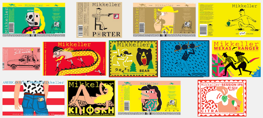


- Mikkeller is a microbrewery founded in 2006 in Copenhagen, Denmark
- based on the so-called "cuckoo", "phantom" or "gypsy" ethos;
- the company does not operate an official brewery and, instead, collaborates with other brewers to produce their recipes or experimental one-off brews.
The brewery was founded by two home brewers: Mikkel Borg Bjergsø, a high school teacher, and journalist Kristian Klarup Keller. Both sought to introduce their home-brewed beer to the public and to "challenge beer friends with intense new tastes", drawing inspiration from the American breweries that "aren't afraid to play and break all the rules".
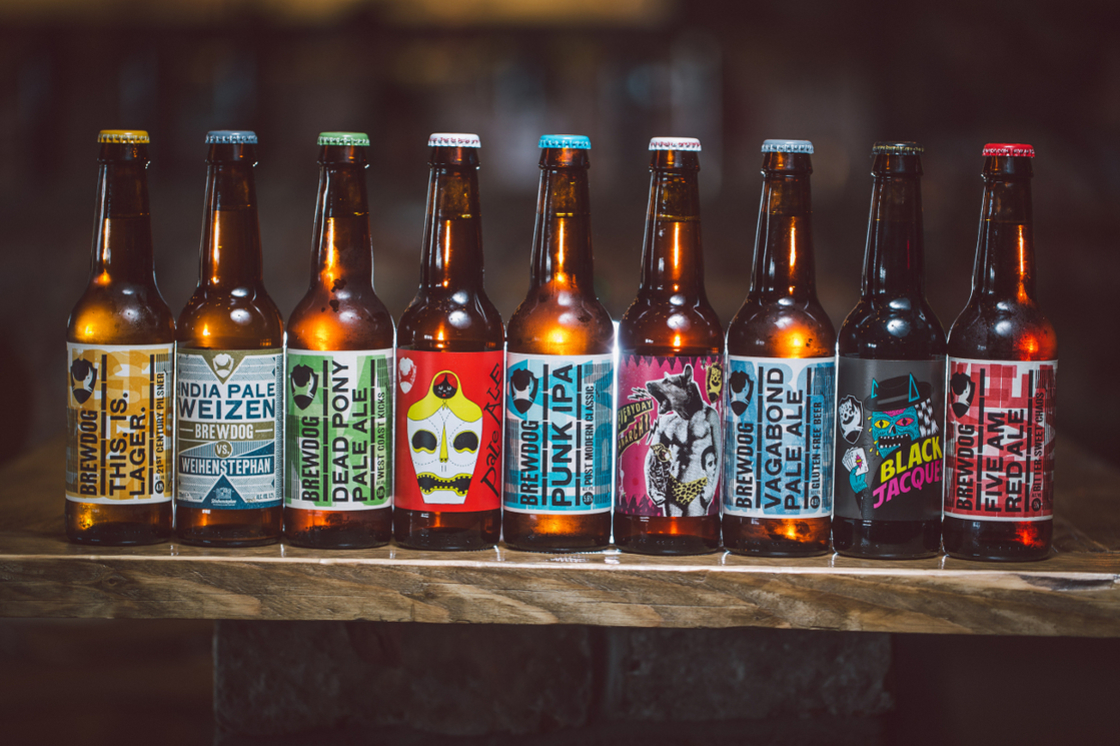
- BrewDog – Black Jacques. Wicked and striking, hinting at the dark monster of a beer inside.
 - very bold and striking through the neon colour scheme
- charismatic and brittle illustration reflects the defiancey of Brewdog to push the boundaries of craft.
- they also have their recognisable but adaptable bottle design which is used throughout.

- Arrogant Bastard
- very in your face and brutal/striking.
- "You're not worthy" - goading you to see if you can handle it

- Omnipollo design by Karl Grandin


Very artisanal, prides itself on being different and minimal to stand out on the shelf
- doesn't need too much information, as believes you can find the information you require online - as its more exclusive.
Will definitely consider Grandin's approach in more detail..
- To Øl labels by Kasper Ledet.
- A very different approach to beer branding. Obviously very digitally orientated, glitchy and bold.
- Doesn't hold back on its tone of voice - explicit and very tongue-and-cheek.

- Odell

- Deschutes

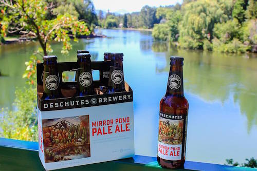
Artistic approach, centres the idyllic illustration and then the bold typography - feels very traditional American.
Strict and consistent design style.
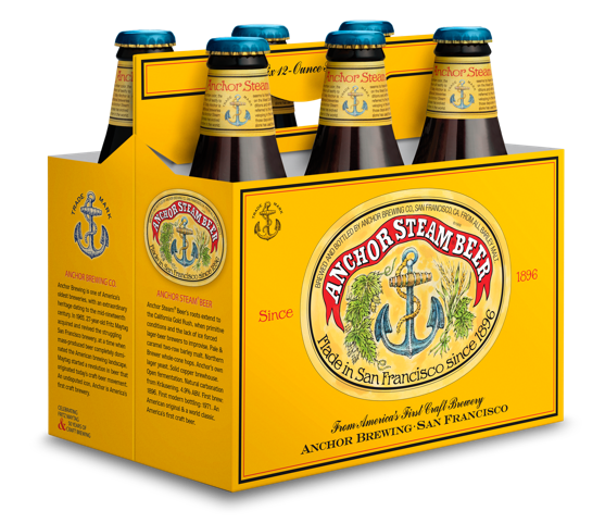
- Anchor Steam has stayed close to its roots and is an iconic brand with no need to change its labels - very traditional feeling given off.
- Adnams Jack Brand
Adnams Spirits, known for its spirits as well as its beer, generated a small but fresh batch of craft beers named after a historic bottle found in the brewery archives.
CookChick Design created the packaging design of all Adnams alcoholic beverages - the combined work of Lee Cook and Sally Chick and a small team of creatives.
The packaging design for the Jack Brand still incorporates the traditional Adnams beer logo, but throws vibrant pastel colours overtop to create a striking look.

- Cloudwater Brew Co.
Manchester-based creative studio DR.MEdesigned a series of surreal collages for independent brewery Cloudwater Brew Co.
The collages depict black and white environmental landscapes with waterways replaced by colourful cloud designs.
DR.ME is made up of Ryan Doyle and Mark Edwards who offer creative services in art direction, image making, graphic design, work shops, video and teaching from a creative studio based in Manchester.

- Polygamy Porter, with the tag line “Why Have Just One?” – brilliant!!
- vintage-y, renaissance art vibe


- 21st Amendment label designs have a consistent illustration style which is recognisable. Although they have creative punch lines they don’t always tell the story effectively - can feel abit random.


No comments:
Post a Comment