

- Their French heritage is definitely something that can be experimented with, but it was clear I needed to sit a strong, justified direction to their company at the forefront of the rebrand as all successful, innovative companies have a strong concept for the consumers to get behind, be inspired by and feel part of.
BEFORE I start to dig deep into Renault individually I wanted to get more inspired by what is already out on the market on-top of what I have already looked at and see how the more flat & simple rebrands are being justified and consumed across different industries...
"Brands have been scrapping their previously complicated logos in favour of flat designs." - dezeen.com
Google revealed a simplified new logo, a month after they announced a company-wide restructure with the launch of umbrella brand - Alphabet.
The design retains that distinctive colour order of the previous Google logo, but the serif typeface has been replaced with a sans-serif alternative whose clean form feel smore welcoming and friendlier - I would add that it better fits this whole adaptable and diverse, whilst straight forward and modern platform they have evolved into.
The logo's distinctive and playfully tilted "e" remains, and the colours appear to have been softened somewhat.
The blue "G" icon – which appears on browser tabs – will also be updated to a four-colour emblem, reflecting the colours of the new wordmark...
According to a blog post written by Tamar Yehoshua, vice president of product management, and Bobby Nath, director of user experience, the logos design is set to reflect being more in-line with people's multi-platform experience of the search engine.
"Once upon a time, Google was one destination that you reached from one device: a desktop PC," the blog post states. "These days people interact with Google products across many different platforms, apps and devices – sometimes all in a single day."
"Today we're introducing a new logo and identity family that reflects this reality and shows you when the Google magic is working for you, even on the tiniest screens."
"We think we've taken the best of Google (simple, uncluttered, colourful, friendly), and recast it not just for the Google of today, but for the Google of the future,"
Google's justifications as to why the step into the modern, simplistic style was essential for them
- stripping back the clutter and creating this all-appropriate platform for everyone which can be pivotal in all aspects of modern life - a search engine, a personal assistant, a satnav, a translator, emails, and many, many more!
Pentagram brings Mastercard into the digital age with pared-back logo redesign
Pentagram has created a new logo and visual identity for Mastercard, the credit card company's first branding redesign in 20 years.
The new design retains the two overlapping red and yellow circles, but swaps the stripes in the central portion for a block orange colour.
The typeface is used in a variety of weights across the applications, while circles in different sizes and opacities also feature.
Although Mastercard's corporate branch had a logo refresh in 2006, the company has stuck with the same public design since 1996.
However the new update aims to help bring the company into the digital age as more card transactions are done online and via apps.
"We took their DNA and went through this process of distillation," he added. "With each wave of simplification it felt sharper cleaner and more flexible."
The logo continues the trend for flat design, which has been adopted by companies like Instagram, Uber – replacing skeumorphic graphics that aim to emulate real-world objects on digital screens.
Kodak rebrand with retro style logo
Kodak has rebranded for the first time in 10 years, ditching its typographic logo for a red and yellow version of the marque it used during the 1970s and 80s.The logo is part of a wider identity refresh by New York-based studio Work-Order, which based its redesign on Kodak's archives.
"We wanted to let the logo be new again," said Work-Order co-founder Keira Alexandra. "We were extremely careful to be respectful to the legacy of the brand, honouring the science and creative vision of Kodak."
"Some of the other companies taking up the trend for minimalist branding have also looked to earlier iterations of their logos for inspiration."
As with all the company's previous logos, it features Kodak's trademark Red and Yellow colours.
The rebrand came after the company revealed it was venturing into the smartphone market with a handset that puts photographic capabilities first - another digital related justification as to why the rebrand has become more of a simplified symbol to fit on screen.
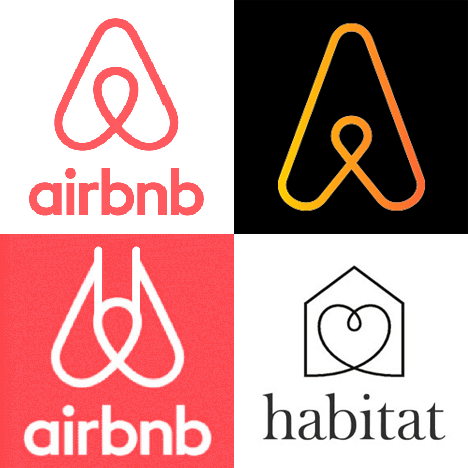
Airbnb Rebrand by DesignStudio
Airbnb asked DesignStudio to overhaul its identity, website and mobile interface and create a consistent visual signature for the company, which was founded by design graduates Brian Chesky and Joe Gebbia in 2008.
- This rebrand reflects another turn to a more simplistic, sans-serif approach.

"The idea we finally settled on was creating a brand that anyone can draw, something that went beyond language and becomes a universal mark," said Greenfield.
Using the brand principle of "belong anywhere", the designers came up with this symbol - called the "Bélo" - which they thought would become easily recognised internationally.
The symbol is designed to represent three things: a person with their arms above their head, a location marker, an upside-down heart – people, places and love – as well as resemble the letter A.

 Personally I am very attracted to the whole concept and identity of the rebrand,
however it did attract some speculation on social media - people comparing it to similar brands using the the same shaped symbol such as Habitat and IT firm Automation Anywhere, there were also references to human genitalia.
This is something I need to be aware of when doing any sort of identity work or rebranding - to do my homework and ensure what I am producing is original and authentic.
Skeumorphism – involves using visual cues from a physical product (such as a leather-bound diary) to indicate its digital counterpart (such as a diary on a computer) like Instagram's old camera logo – was popular in the first wave of app design, but is increasingly being phased out.
"Skeumorphism acted as a way to get people used to smartphones, making them think that it is an evolution of their daily life objects, like an agenda."
BUT in 2014, Google unveiled skeumorphism-free design guidelines for software across its desktop and mobile platforms, called Material Design.
"Material Design is part of a new way of thinking about software presentation commonly referred to as 'flat design'...
Flat design recognises that we've learned to understand what we can and can't interact with on computer screens, allowing the interface to slip away, and what you're reading, watching, or whatever, take the stage."
Flat design recognises that we've learned to understand what we can and can't interact with on computer screens, allowing the interface to slip away, and what you're reading, watching, or whatever, take the stage."
So over time we have incorporated these now universally recognised symbols to represent various features/paths/interactivity on our screens - it has almost become a new efficient digital language.
- This is what has allowed us to now start stripping back our designs once more, as design is all about being most visually appropriate and efficient in order to aid our everyday lives.
No comments:
Post a Comment