Tesla use more boast-y devices about performance not just sustainability.
- performance with a clean conscience
- go boldy into the future
- redefining green
- silent, fast, 100% electric
The likes of BMW use similar cocky, boasting catchlines to appeal to their uppermarket audiences
- my bonus is faster than yours
I need to be able to address this confidence of Tesla and BMW, but spin it onto the everyday person
- Lambo-greeny
- Tesla, but affordable
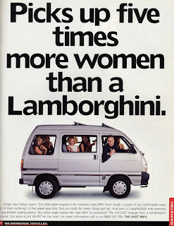
I looked at how the more retro car posters approached print ads too..
Sense of humour was key in a lot of them, and the smaller more affordable car companies played on these devices a lot to keep themselves in the market.
Sex always sells too!
But the most successful posters today are the ones which are dark, simplistic but too the point.. that of Mercedes for example..
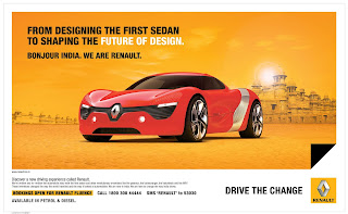
I also looked at what Renault already have out on the market..
I feel like this is their strongest ad, high quality image, simplistic but intelligent layout, gets your attentionOlder ones use bold colour and type
Another minimal design, which makes them appear so much more sophisticated
Upon Renault's introduction to customs with India a new campaign was released.
- This attempted to boast their heritage and what Renault are actually responsible for in the world of automotive..
But for me, I like the wording and layout of the posters (and the consistency through colour and layout) but the facts and punchlines don't attract regular car buyers, that of whom their target audience is so filled with.. people don't care about what they are boasting about, it needs to be more broad and assertive on everyone, give people something they can get behind.
They talk alot about 'shaping the future', so this is definitely something to develop on.
- People don't expect something too crazy for an affordable car - I need to focus on its aspects, keep it clean and reflect the drive of the brand.
- top of the line companies still use minimal layouts - sharper, to the point


No comments:
Post a Comment